PORTRUSH FAMILY DENTAL
PROJECT SCOPE
Visual Identity
Marketing Collateral
Signage
Extensive Style Guide
Visual Identity
Marketing Collateral
Signage
Extensive Style Guide
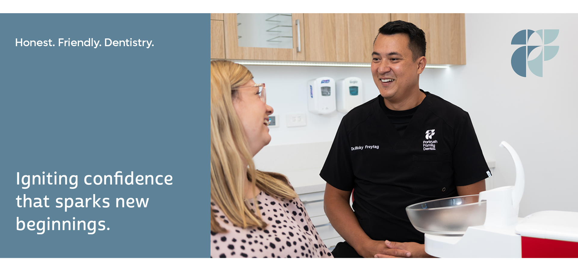
Honest and friendly, forward thinking dentistry...
Portrush Family Dental provide optimal care and honest dentistry, so their patients feel confident with the decision making around their oral health.
Ricky engaged Designable to rebrand his business to reflect the new clinic that he was building. His business was expanding from a 2 seat practice to 5 and he wanted the branding to reflect this new era and growth. Modern, family friendly and supportive were the key words that he wanted the business to portray.
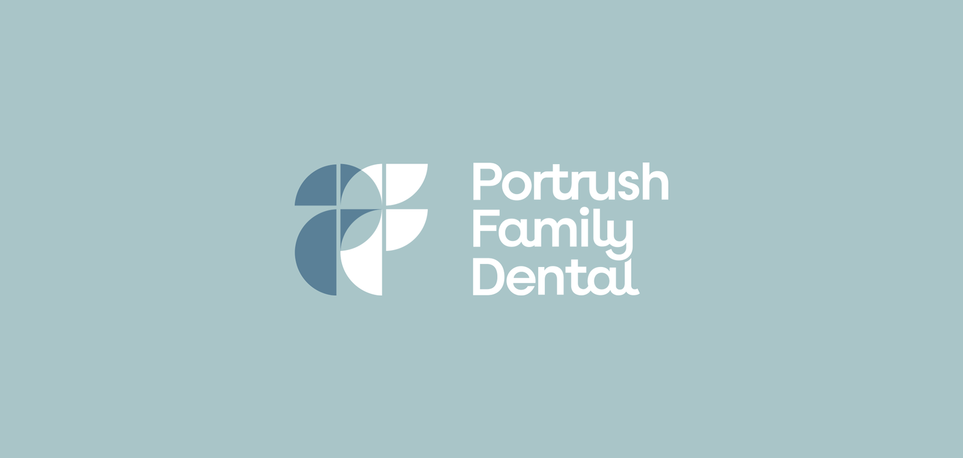
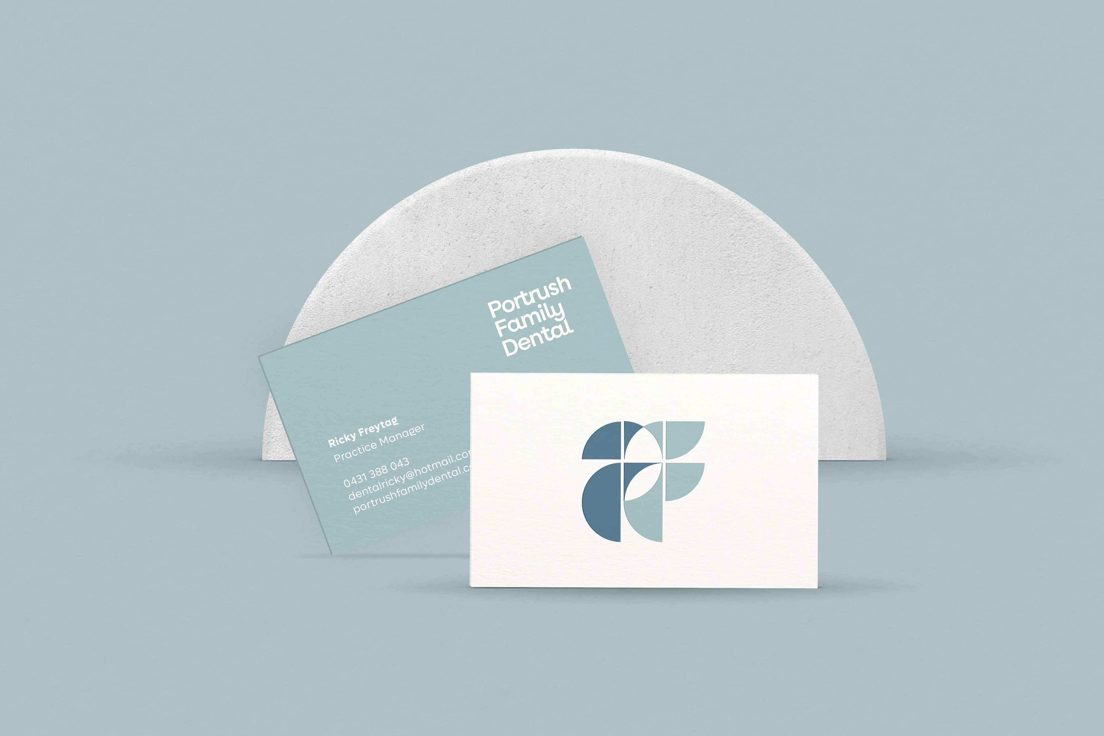
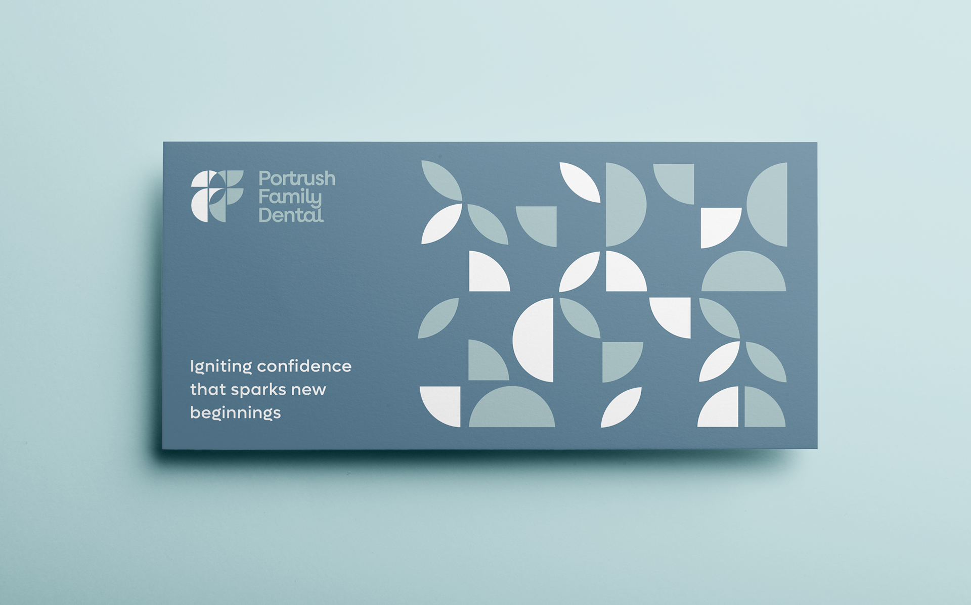
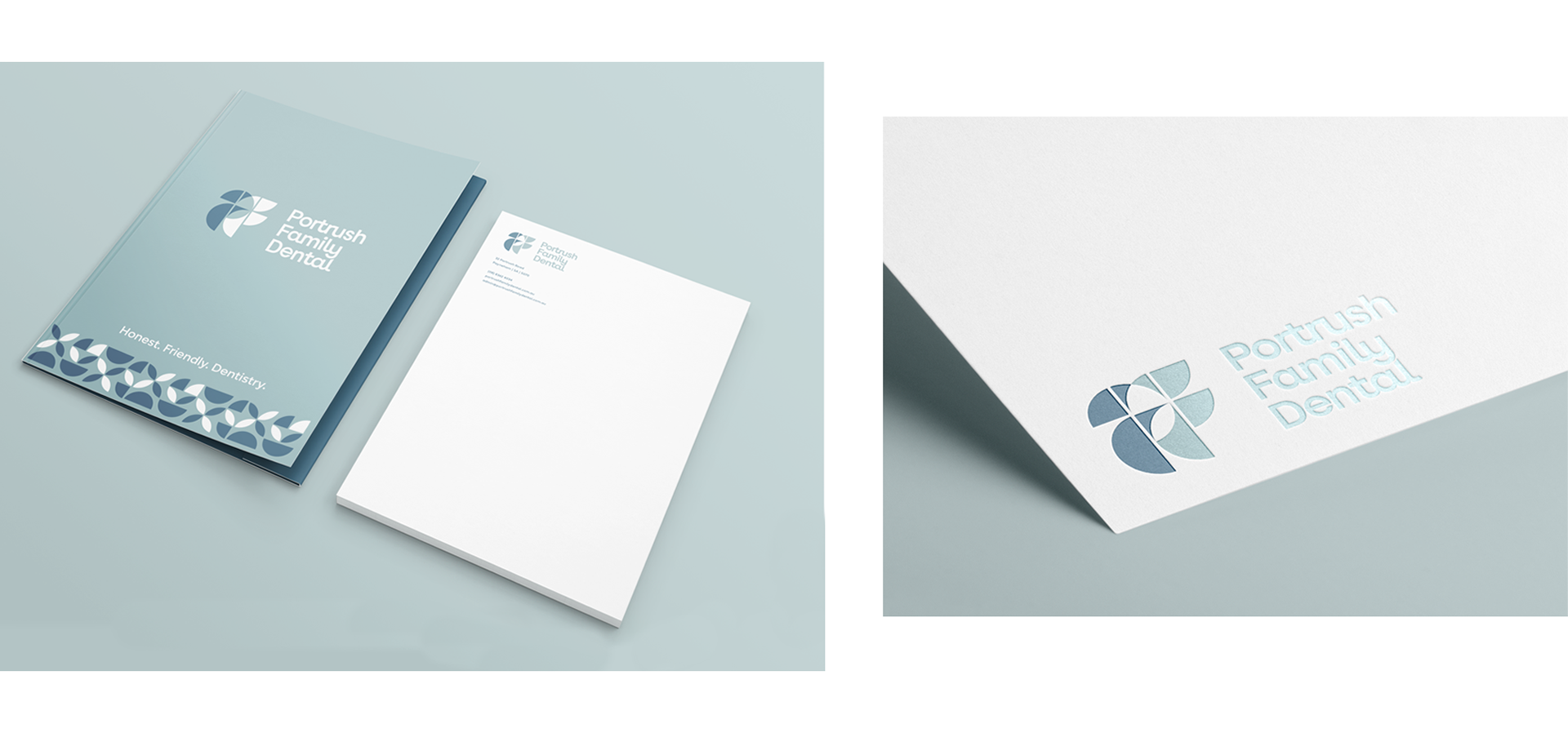
The logo embodies the process and end result, inspired by smooth edges, alignment and a supportive culture. The shapes were used throughout the brand identity and have a playful connotation that connects with children and adults alike.
Ricky engaged Designable to rebrand his business to reflect the new clinic that he was building. His business was expanding from a 2 seat practice to 5 and he wanted the branding to reflect this new era and growth. Modern, family friendly and supportive were the key words that he wanted the business to portray.
The logo embodies the process and end result, inspired by smooth edges, alignment and a supportive culture. The shapes were used throughout the brand identity and have a playful connotation that connects with children and adults alike.
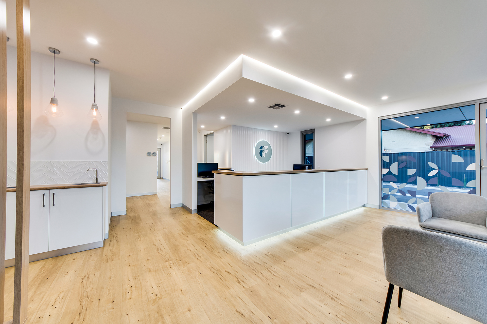
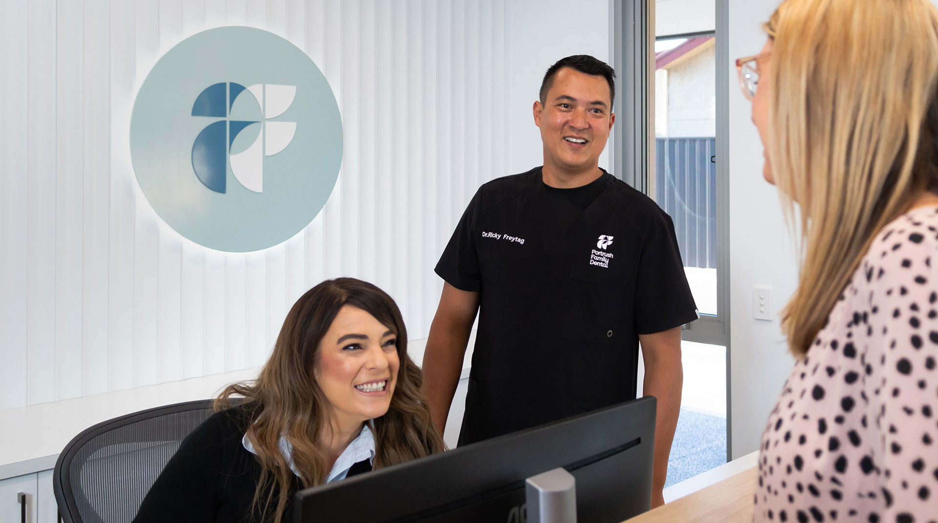
A modern, bright environment with a relaxed feel
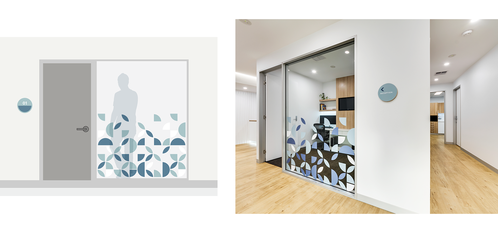
The build and interior of Portrush Family Dental had been designed by the talented team at Optima. Designable created the new signage to complement the building's beautiful aesthetic.
A simple acrylic disk with the emblem was installed in the reception and the geometric pattern was applied as a decal to the windows on the exterior and interior. Simple room numbers using circular shapes were made for ease of navigation around the clinic.
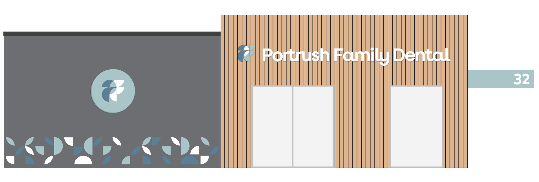
Bold signage that was visible from the street, clearly identifies the new clinic and attracts new customers passing by.
A simple acrylic disk with the emblem was installed in the reception and the geometric pattern was applied as a decal to the windows on the exterior and interior. Simple room numbers using circular shapes were made for ease of navigation around the clinic.
Bold signage that was visible from the street, clearly identifies the new clinic and attracts new customers passing by.
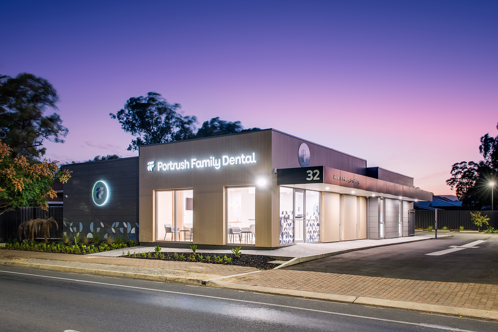
IMAGE CREDIT: OPTIMA